
ScrapEase - A Service Design Approach to Transforming India’s Scrap Industry

Role
User Research, User Testing, Redesign
Industry
Sustainability, Civic Tech
Team
4 members (collaborative academic project)
Duration
1.5 Months
Summary
We designed ScrapEase, a digital service improving India’s informal scrap collection system through structure, inclusivity, and empathy-driven design. The goal was to simplify daily operations for scrap dealers, a niche, often overlooked user group - by understanding their environment, workflows, and pain points deeply enough to make technology feel like second nature.
Problem
In India, scrap collection is largely driven by local “raddi walas” and small scrap dealers who form the backbone of the informal recycling economy. However, their work remains unstructured - with no standardized pricing, tracking, or communication systems. Existing digital initiatives have struggled to gain adoption because they often overlook on-ground realities such as language diversity, limited digital literacy, unstable connectivity, and a general mistrust of formal platforms.
Solution
Through immersive field research and iterative usability testing, We designed a mobile-first platform that aligns with how scrap dealers actually work, not how tech assumes they do.
The final product features a simplified daily workflow, regional language support, icon-based navigation, and instant task feedback, reducing cognitive effort and empowering users to adopt technology without fear or confusion.
Design Process & Rationale
Phase 1 - Discovery
Challenge: Understand the lived reality of an underserved user group before defining any interface.
Spent time observing local scrap dealers at work, watching how they manage pickups, negotiate prices, and record details.
Conducted informal interviews in native languages to understand how they perceive “technology” and their frustrations with existing systems.
Realized that trust and comprehension were bigger barriers than access.
Documented contextual factors: noisy environments, limited time, small screens, and intermittent connectivity.
Built empathy maps to capture emotional and behavioral patterns not just actions, but motivations and fears.
Key Decision: Design from their comfort zone outward, not from a typical digital-first perspective, every interaction needed to feel familiar and forgiving.
Phase 2 - Strategic Foundation
Challenge: Reimagine the workflow to match the real rhythm of their day.
Mapped each stage of a scrap dealer’s routine from morning pickups to end-of-day summaries and mirrored that structure in the app’s navigation.
Defined a linear, lightweight flow that surfaces only “Today’s Tasks” no clutter, no overload.
Replaced text-heavy screens with visuals and icons representing task types and materials.
Designed for mobile number login instead of email, and added regional language onboarding for immediate comfort.
Tested paper prototypes directly in field environments to observe hesitation, misclicks, and confusion.
Key Decision: Build an emotionally frictionless workflow, users see only what’s relevant, one action at a time, to reduce stress and cognitive load.
Phase 3 - Design
Challenge: Translate empathy insights into a scalable, adaptable system.
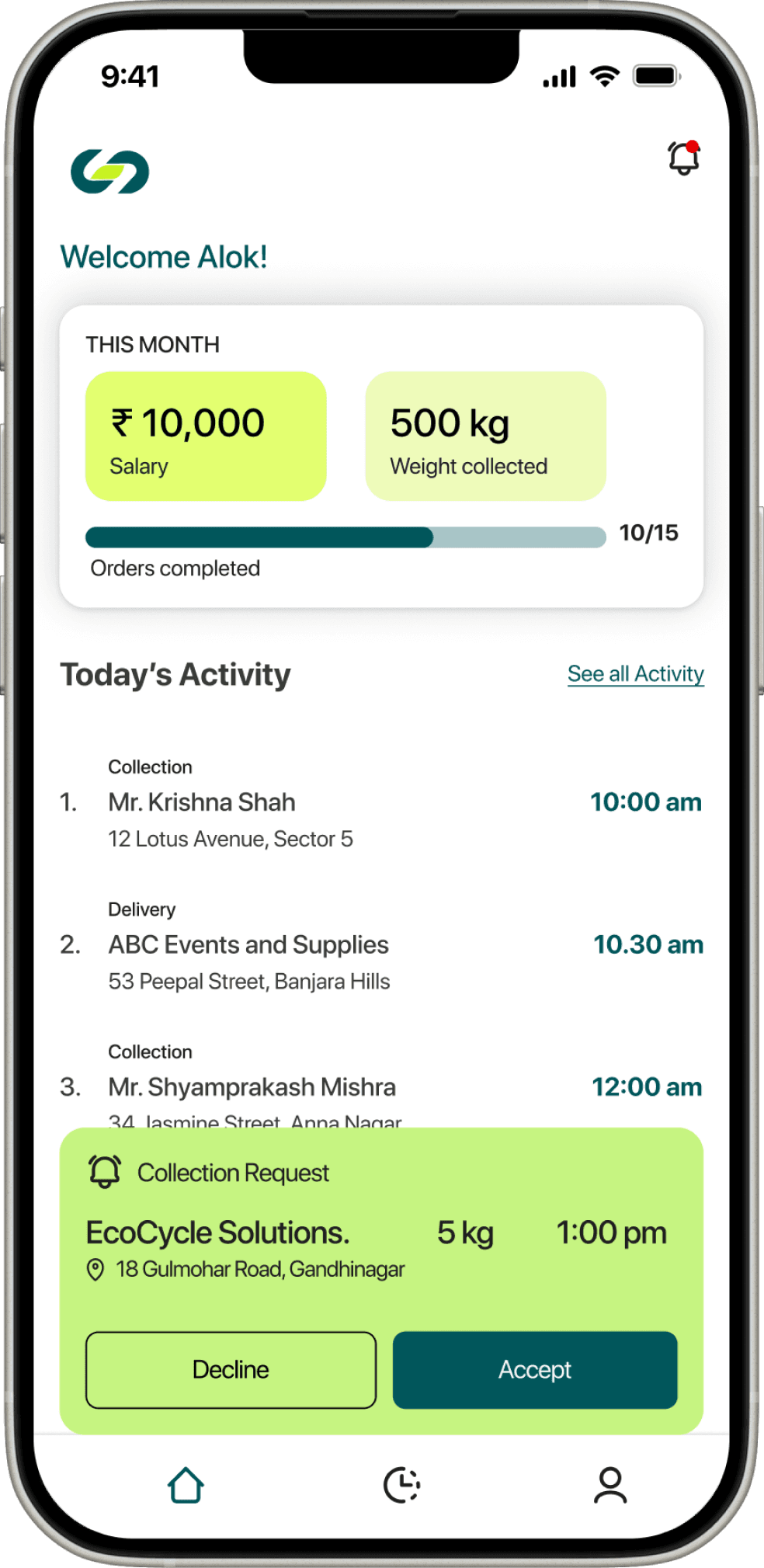
Dashboard: Focused on “Today’s Pickups,” customer details, and simple task progress.
Task Screen: One clear CTA (“Start Task”), progress bar, and real-time confirmation feedback.
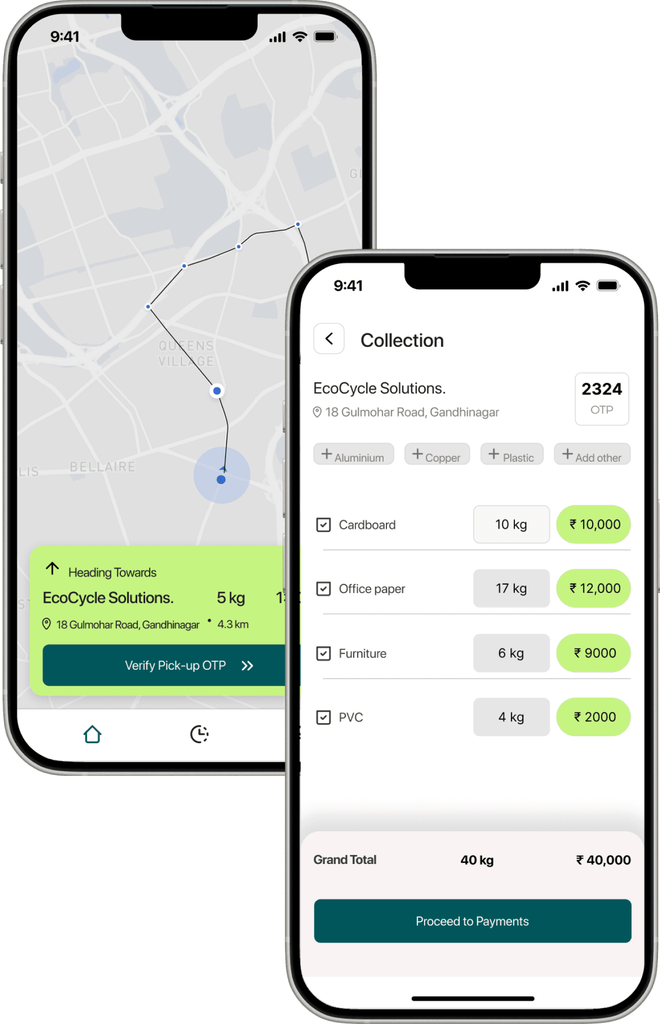
Assets Library: Managed materials, weights, and earnings through recognizable visuals.
Profile & Support: Added easy-access help and contact options to reduce dependency on others.
Built a high-contrast, large-tap visual system optimized for low-end smartphones.
Designed the framework to support future modules like rewards, route tracking, or community hubs.
Key Decision: Created a lightweight but scalable system — one that grows with users, not ahead of them.
Before & After User Testing
Before
Direct onboarding in english
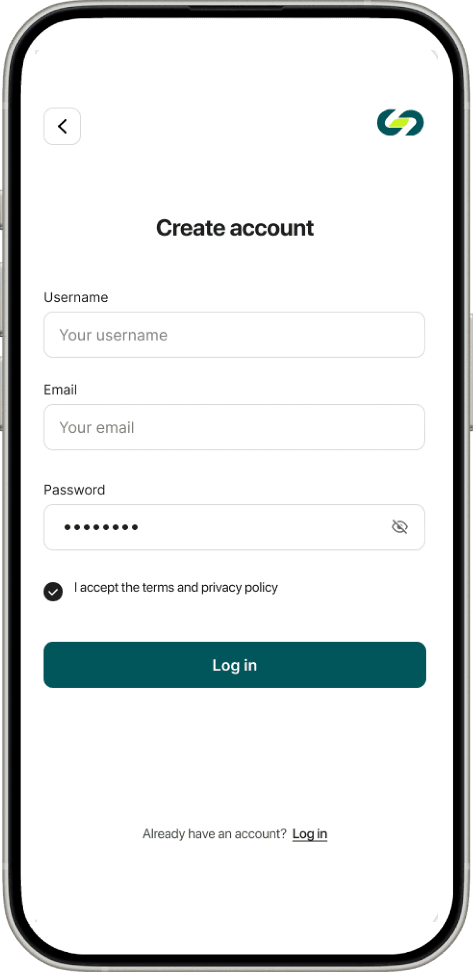
Requiring email for login, which many scrap dealers did not have or use, also irrelevant to the service.
Displayed tasks for the entire week, leading to a cluttered UI with too much information, causing mental overload and difficulty in understanding what to do.
The navigation had overlapping information. causing confusion about where to find specific tasks or details. Leading to unnecessary complexity and made
it harder to navigate effectively.
No clear direction to the scrap dealer on the next steps or actions to take, and lacked a confirmation process after completing each task
The upcoming screens lacked clear call-to-action (CTA) buttons, leaving users unsure of the next steps. Information was unclear, with the name of the customer shown more prominently than the address, leading to confusion.
After
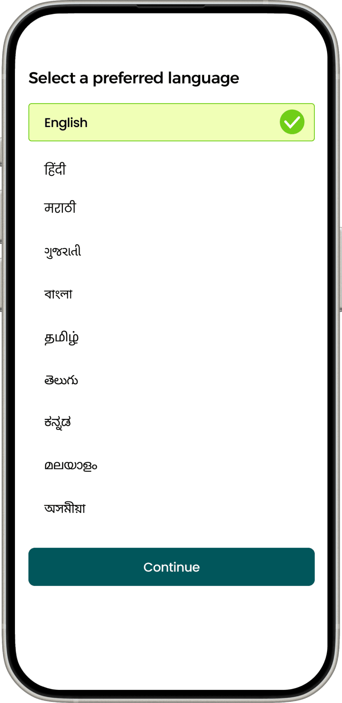
Added language selection at the start for easier use by scrap dealers.
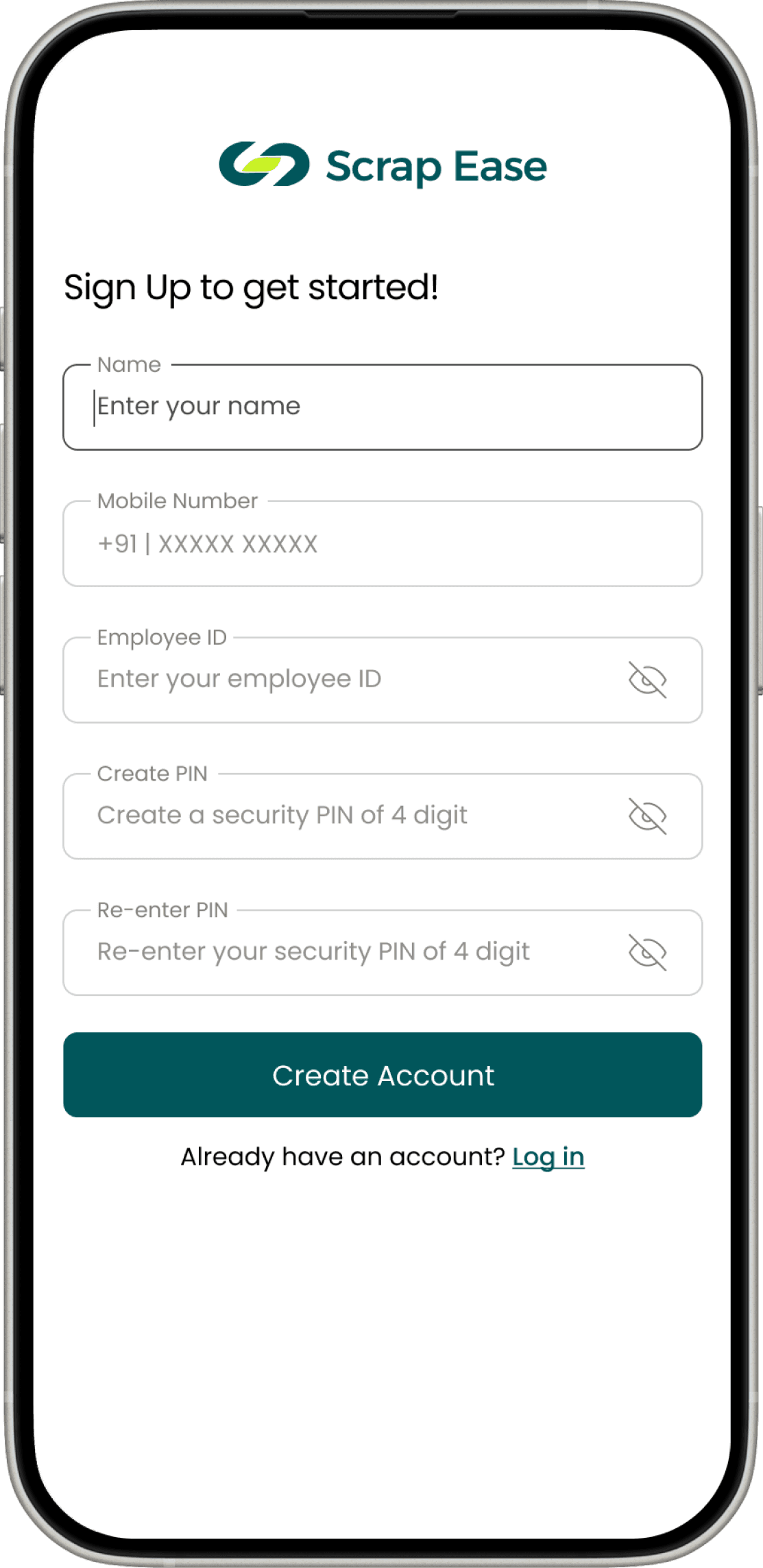
Replaced email field with mobile number as the target group are more familiar with this. Added employee ID & PIN for secure login of employees.
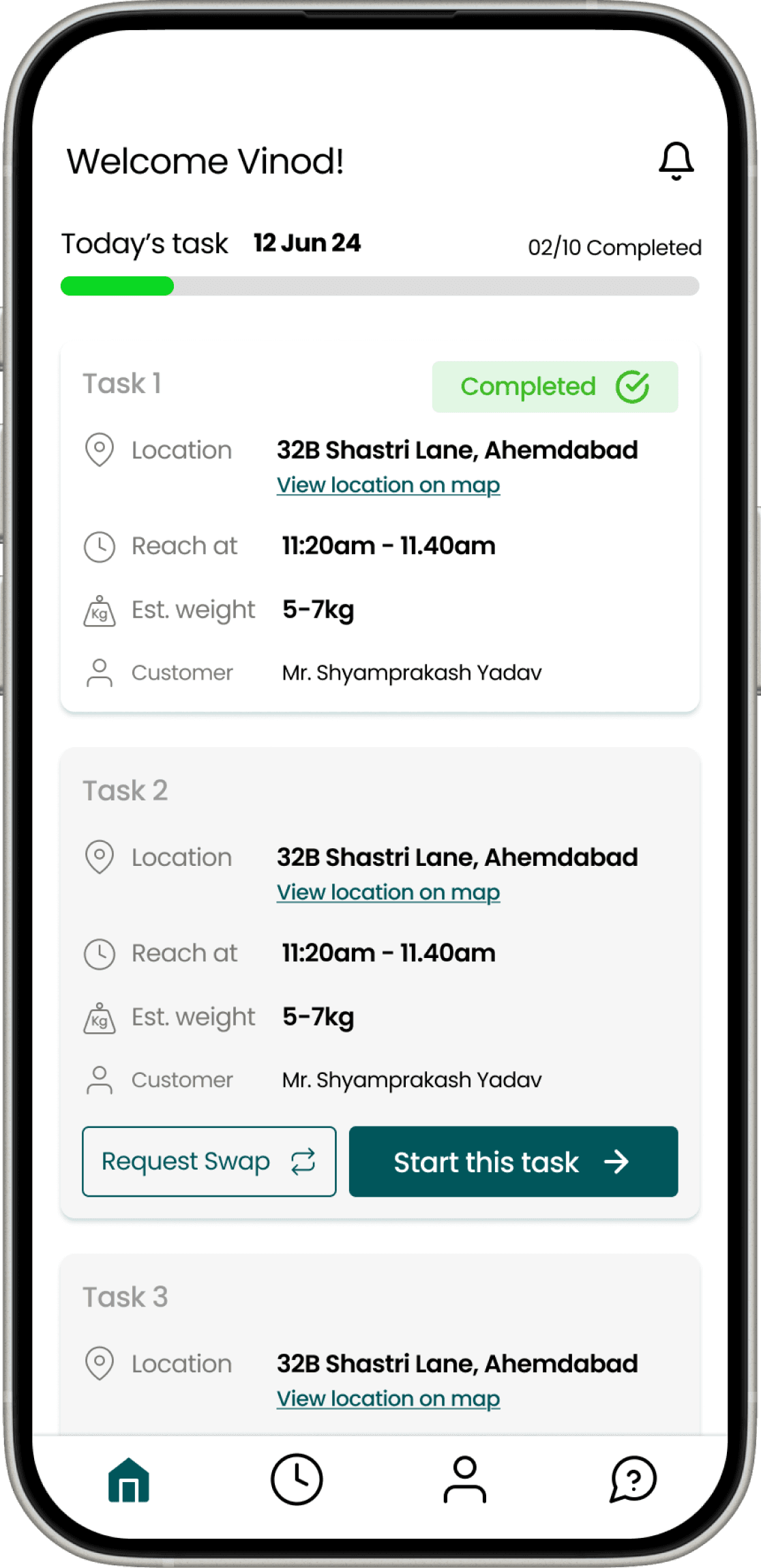
Only shows "Today's" tasks, added progress bar, simplified task overview with a clear "Start Task" button.
The navigation was simplified to four clear and prominent options:
Home – Displays the dealer’s daily tasks.
History/Management – Shows the daily, weekly, and monthly task history for record-keeping.
Profile – Allows dealers to view and update their personal details.
Help – Provides access to customer support if the dealer faces issues that cannot be resolved independently.
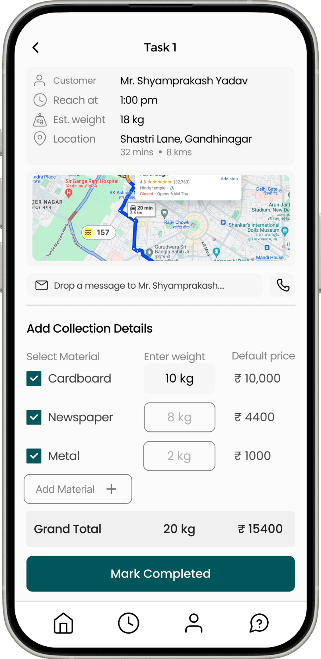
Divided task information into three clear sections: task details (where/when), scrap quantity & materials, and task completion verification. Providing a clarity. Also an option to contact the customer in case of any query.
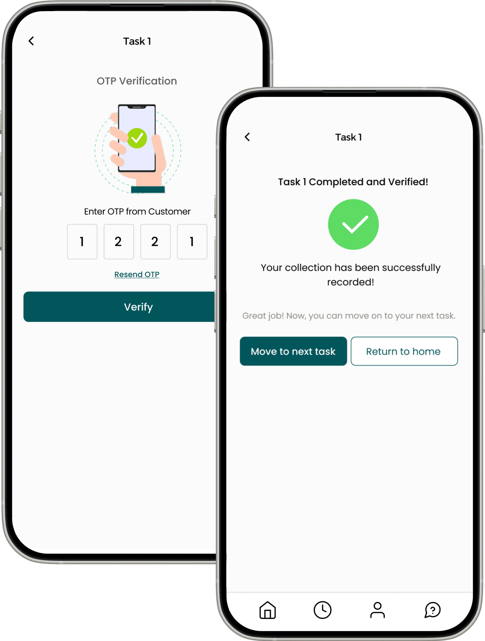
Dealers receive confirmation that their task is finished. Clear instructions for the next steps are also provided. This helps reduce confusion and enhances task flow efficiency.
Potential Impact
Positioned as a concept with real potential to formalize informal waste work and empower local communities.
Simplified workflows show strong potential to improve usability for low-literacy users.
Multilingual and visual-first design could enable wider adoption among informal scrap networks.
The system’s modular design supports future scalability and integration with sustainability programs.
Takeaways
Empathy before efficiency. Real understanding shapes real usability.
Context defines success. Design must meet users where they are.
Simplicity equals inclusion. Reducing cognitive load is a form of accessibility.
Usability testing is insight, not validation. Every confusion is a design cue.